 I have been a little hesitant about posting on the Victorian Bushfires until now, simply because it was all too sad and too real here in Victoria. As a teacher, and particularly a Geography teacher, it was a topic that was spoken about in classes, but I really did need to think about what I was going to say, and how I was going to deliver this information. For most teachers in Victoria, and particularly Melbourne, we had students in our classroom who were either immediately affected, or knew someone who was affected by the bushfires.
I had Geography on the Friday prior to Black Saturday (7th February). I had no inkling of what was going to occur, but I was introducing the topic 'What is Geography?' to my students, so was showing them the Bureau of Meteorology site and the predicted extreme forecast for the weekend. We spoke about the weather conditions and why extreme fire danger was a real threat to most of Victoria. Following the weekend, a number of students recalled that discussion in class, and I did need to spend some time on it. The lesson was on 'Spatial Concepts', so the class was clearly able to identify spatial associations between Bushfire hotspots and the number of abnormally hot days in Victoria. It was a valuable lesson in the importance of Geography in everyday lives. The continuing news broadcast also displayed the importance of mapping and spatial technologies in both the fire fighting and recovery effort. Many of my students would turn up to school with footage from the news broadcasters that had topographic maps in the background, and online mapping tools as visuals.
So, in saying all of that, there are a number of interactive GIS maps out there on the internet that allow students to look at differing layers of natural hazard data. Following the Bushfires in Victoria, more of these sites emerged. Below, I have outlined some that I have used successfully in my Geography classes. My suggestion is to develop handouts for the students to complete as they look at these sites....
 The World Natural Hazards Website provides a global view on natural hazards and disasters around the world. This site is structured like a true GIS based interactive map, allowing the user to turn on and off a number of layers. It also includes demographic data, infrastructure data and operates in real time. Using the Information tool allows the user to find out about specific hazards in specific regions. This site will not be as specific as more local or Australian based websites, but is great to have for the students when studying any natural hazards or disasters.
Sentinel Bushfire Mapping is produced by the CSIRO. This map provides an overview of the hotspots in Australia for the last 24 - 48 hours. The site has basic GIS applications and allows the user to turn differing layers on and off. This site has been inundated in the last few weeks, and therefore may be slow and a little bit out of date.

Google Victoria Fires Map uses RSS feeds from the Country Fire Authority to up-date the map. You can also look at the most recent satellite imagery from the fires. One of the reasons that Google Maps produced this site was to take the pressure off other CFA and Bushfire mapping sites. An article on the development of this map was written by CNet, Google Maps Track Deadly Australian Bushfires.

I found that the ABC News Bushfire Emergency Map, powered by Microsoft Virtual Earth, was also a great map to look at. This provided a little more detail on the human and infrastructure costs, and had links to current news events. This map was utilised by a number of people in the fire affected area. The ABC News site is also one of the best in terms of information about the disaster.
Using satellite imagery is, I believe, the best way to explain the extent and nature of a natural disaster such as bushfires to students. The NASA Earth Observatory is always my first port of call, providing excellent imagery as well as a detailed and easy to understand explanation of how the imagery was collected and what it shows. The most telling image would be the Image of the Day on February 5th - Exceptional Australian Heat Wave, February 10th - Bushfires in South East Australia, February 14th - Bushfires in South East Australia and February 18th - Killmore East-Murrindindi Complex South Fire, Victoria.
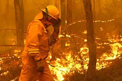
I hope these sites are useful! If you know of any others, please comment. The image of the fire above was taken from d200dug on Flickr.


